liesl & jeroen
Liesl and Jeroen asked for a functional and livable kitchen. A kitchen island was the best choice for the circulation. The island, in shades of red, is combined with a more subtle wall arrangement.
The centerpiece is a real eye catcher. Its colours are matched with the beam in classic red vermilion. The pink concrete worktop provides a soft touch on top of the brighter red fronts. The brushed stainless steel plinth makes it look like it’s floating. By rounding two corners of the island, the shape becomes softer and the circulation more optimal.
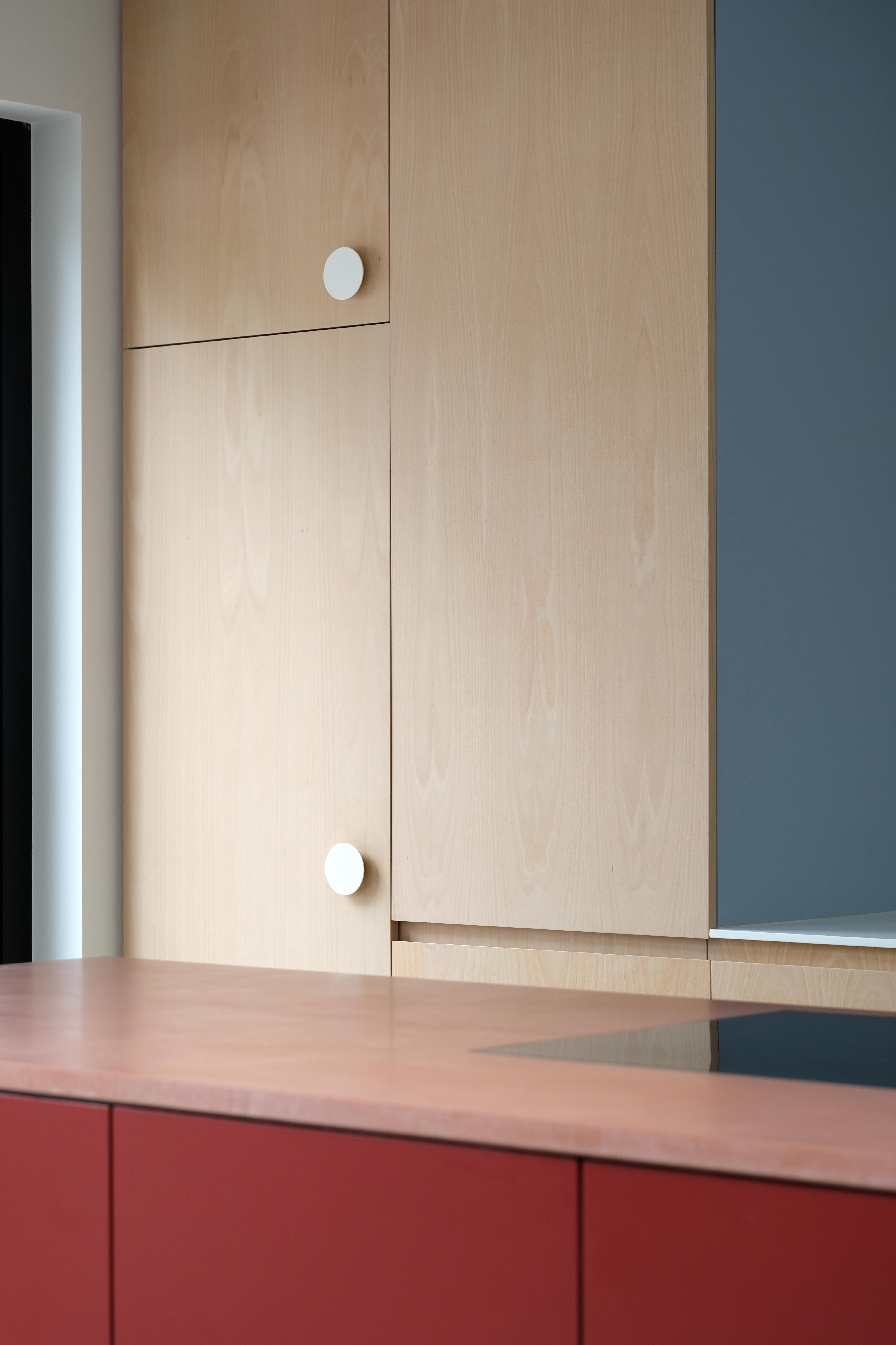
The wall arrangement is made of beech wood, the kitchen counter is in a neutral, white composite. The beech wood is also used in other, original parts of the renovated house. The side of the left high cupboard is painted in light blue, to achieve a unique match with the red island. Working with different colours, materials and handles in the right proportions, creates harmony.
Here you can read an article about the design at the website of Feeling Wonen.
(pictures by Kaatje Verschoren)